Google’s long talked-about “mobile first” strategy is now rolling out in earnest. Here is a quote from the Google Webmaster Central Blog of Monday, March 26, 2018:
"To recap, our crawling, indexing, and ranking systems have typically used the desktop version of a page's content, which may cause issues for mobile searchers when that version is vastly different from the mobile version. Mobile-first indexing means that we'll use the mobile version of the page for indexing and ranking, to better help our -- primarily mobile -- users find what they're looking for."
 The “primarily mobile” users referred to are the 56% of website visits from mobile devices as opposed to the 44% from desktop computers. How the breakdown between desktop and mobile is determined from the far end is somewhat hazy, especially with smaller screen laptops and “netbooks”. Nevertheless, with more than half of website visits now originating from devices other than desktop computers with large displays, Google has decided that how your site performs on what are referred to as “mobile devices” will ultimately determine your site’s ranking.
CSS Is Not Enough
Many years ago, when all one had to worry about was whether an end user had a newer, larger monitor connected to their desktop computer you could adjust the look of your site with a bit of JavaScript:

Pretty clunky by today’s standards, but adequate 15 years ago.
Newer versions of HTML and CSS introduced media queries to address this issue:
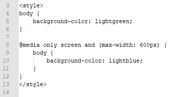
These workarounds, old and newer, try to adjust the look of your site depending on the screen size on which it is being viewed. To really make your site viewable across all devices it must be “responsive”, that is it must respond to changes in screen size and even orientation.
To attempt a responsive design usually means a complete site re-do. Early websites were considered amazing if they had some images and iframes. Then tables came into vogue for content layout. When web developers admitted that tables were meant for tabular data, not layout purposes it was all about div’s. Now grid layouts and columns are being used. It is not just the arrangement of the page elements that needs to be considered. Fonts and images need to be resized. Font colours and background colours need to be changed to higher contrast for readability in bright light conditions. Navigation items such as menus and links need to work on a touch screen.
Most people, even those with development experience, throw up their hands and use a ready-made template.
A Separate Mobile Site Is Apparently Not the Answer
When smartphones were still in their infancy I taught a course on programming pocket PC’s. You may remember pocket PC’s as those devices with a delicate screen and a scratchy stylus. A common tactic back then if a user accessed your Internet site on their small-screen device was to redirect the user to an entirely different mobile “site” in a sub-folder of your main site when the small screen was detected. The mobile site was a stripped down version of the “real” site. The mobile site had less text and smaller graphics and was really just a way to keep a user engaged long enough for them to consider visiting your real site from a real computer.
According to Search Engine Journal (https://www.searchenginejournal.com/googles-mobile-first-indexing-what-it-is-how-you-can-prepare/212104/):
"If you have a site configuration where the primary content and markup is different across mobile and desktop, you should consider making some changes to your site."
Ironically, Google’s own “Basic principles” listed on their “Quality guidelines” article (https://support.google.com/webmasters/answer/35769#quality_guidelines) include the following:
- Make pages primarily for users, not for search engines.
- Avoid tricks intended to improve search engine rankings.
The constantly moving target that is Google Search Engine Optimization has spawned an entire industry devoted to promising top-of-the-first-results-page for less than the cost of Google Ad Words. Now it is also padding the retirement accounts of web developers able to deliver responsive design sites. This is not necessarily a bad thing – after all, I do web development myself. What does concern me is that “quality” thing.
What Are Users Doing With Their Phones?
Back in college, one of my professors said that computers were mostly used for “LUS” (Looking Up Shit). The same can be said for mobile devices. Phones are used to get directions, check store hours, scan QR codes, check the weather forecast, and a host of other simple actions that streamline the user’s day. Few users are going to stumble across a copy of “War and Peace” online and start reading it on their iPhone.
SEO guru Neil Patel (https://neilpatel.com/blog/prepare-googles-mobile-first-algorithm/) offers some friendly advice for optimizing your site for mobile devices:
“...reduce some of the burdens on the reader. A 3,000-word blog post looks great on a desktop. But it can be intimidating on a mobile device. Using short paragraphs to break up content will help...”
Yes, the web is becoming “Twitterized”. The one-liner format is taking over. Resistance, it would appear, is futile.
I am currently developing and maintaining a website for a local museum. The site is not “mobile-friendly” and will not be any time soon. The site contains lots of images, slideshows, and long articles that are just not going to work on a smartphone. We have made the decision to go with a separate mobile site that will contain quick lookup items such as hours, directions, upcoming event listings, self-guided walking tours and QR code lookups of information about local buildings. This decision will no doubt affect Google’s ranking of the museum’s site negatively.
The Return of the “Brochure Site”
When the Internet first exploded it was considered essential to have a site – any site – to promote your organization. Comparisons were often made to having a Yellow Pages listing. As sites became more complex and included database connectivity, the much-touted educational potential of the Internet looked like it was becoming a reality. It would seem that the priority being given to small-screen mobile devices is turning back the clock.
Find other ways to bring traffic to your site or start dumbing it down.